
Responsive Platform for Configuring Integrations


Key Accomplishment
Empowered alumni management teams to seamlessly configure their own integrations by designing a robust, responsive experience.
Primary Team
UI/UX Designer, Product Manager, Front-End Developer
Timeline
2 months
Context
EnterpriseAlumni is powering the alumni networks of the world’s largest organizations. Corporate leaders use the EA suite of products to manage their alumni networks.
Due to technological constraints, integrations, including authentication methods, APIs, file-based integrations, and webhooks, could only be enabled by contacting EA’s customer support team.
Business Goal
Integration Center would be a critical component of EnterpriseAlumni's strategy to provide additional value to its customers. The primary business goal for this initiative was to address the growing demand for integration capabilities from potential clients. Through consultations with sales representatives, it became clear that establishing a dedicated Integration Center would provide significant value to both existing alumni teams and future prospects.
Overview
Integration Center would ultimately include four sections: Authentication Methods, APIs, File-Based Integrations, and Webhooks.
Webhooks are automated messages that are triggered based on a defined event. For example, engineers could configure a webhook so the alumni management team receives a notification on Slack whenever a new user completes registration to join their alumni network.
Essentially, webhooks allow alumni administrators to customize the alerts they receive and the platform on which they receive them.
Though this case study focuses specifically on the Webhooks portion of Integration Center, I built this design solution to be robust, versatile, and mobile responsive to ensure that these components could be used for the other sections as well.
Design Process

Persona Introduction: Dominique
Dominique Williams is a Software Engineer at YourCorp, and she has been tasked with enabling integrations for the YourCorp Alumni Network on EnterpriseAlumni.
Dominique is a skilled engineer who is very knowledgeable about integrations, including webhooks. When she uses Integration Center, she expects this process to be straightforward and easy to use.
Due to her extensive background knowledge, only limited explanations are necessary.
Ultimately, Integration Center should be geared toward Dominique and others of similar levels of familiarity.
Initial Sketch
Before diving into digital design, my first step was putting pen to paper.
Due to the complex nature of the various components of Integration Center, I chose to add an info box for each page that would prominently display background information and include relevant external links.
I primarily focused on what would be the most complicated part of this page: how users would add and edit their webhooks. The main feature of this page would be the webhooks table. Initially, this table included four columns:
Endpoint: User-inputted URL that will receive webhook event notifications
Method: A dropdown of HTTP methods for retrieving from and sending data to a server
Authentication Type: A dropdown list of the authentication types that the user has defined in another section of Integration Center
Events: A list of the events that are available for this webhook
Beneath the table, this page also includes a CTA to add a new endpoint.
Webhooks Wireframe v1
My initial wireframe allowed for in-line editing for all rows at any time. Users can type the Endpoint via an input field and select the Method and Authentication Type from dropdown menus. They can add Events via a dropdown menu, and each selected event will display as a pill.
Stakeholder Feedback: From a development perspective, it would be difficult for all table entries to always remain in the editable state.
Webhooks Wireframe v2
To minimize complexity, I conceived two modes for the tables: Review Mode and Edit Mode.
In Review Mode, users would be able to view all of their selections, but they would not be able to make any edits.
For Events, users would only be able to see the events that they have already selected.
This iteration also included the addition of a new field: Data Type. The events available for each webhook would change depending on the selected Data Type.
While in Edit mode, users can update the Endpoint via an input text field and update the Method, Authentication Type, and Data Type via dropdowns.
All available events are shown in this view, with selected events indicated by a selected checkbox and a different color. This indicates whether or not events are selected using both color and icons.
Stakeholder Feedback: This might still be too difficult to implement technically. Also, users should be able to see all events that are available to them at all times and clearly see which ones they have selected.
Webhooks Wireframe v3
To further reduce technical complexity, I removed Review Mode and Edit Mode in favor of allowing users to select rows to edit individually.
The first row is shown in Review Mode, in which no edits can be made. To make it clear to the user that these fields are disabled, all events would be shown with 50% opacity.
The second row is shown in Edit Mode. In addition to 100% opacity, these event pills have selected or unselected checkboxes to signify an available interaction.
Stakeholder Feedback: This will be a great starting place to use for building the final user interface.
Low-Fidelity Prototype v1
Once I began working in Adobe XD, my first task was to define the table behavior, specifically considering the Events column, as this was the most complicated section.
I started by designing a single row of this table so I could focus on the intricate details.
Stakeholder Feedback: In the event pills, the checkboxes, specifically when they are unselected, are not immediately clear. This will particularly be an issue for the empty state in which all of the checkboxes would be unselected.
Low-Fidelity Prototype v2
With this iteration, I updated the event pills to no longer include checkboxes. Instead, these pills included either a plus sign or an X. The plus sign indicates that an event can be added, while the X indicates that a selected event can be removed.
Additional updates included consolidating the edit and delete icons within the table row and updating colors and other icons throughout.
Stakeholder Feedback: This iteration successfully addresses previous concerns regarding the event pills.
Responsive Table Design
Now that the UI for the tables was mostly finalized, it was time for a deep dive into how this table (and all similar tables in Integration Center) would behave responsively.
Responsive design is not always necessary for B2B platforms. In this case, Webhooks would serve as the foundation for Integration Center, so it was important for our team to define the responsive behavior so we would have the option to implement any of these pages responsively, depending on user need.
I collaborated closely with a Front-End Engineer to define how tables should behave at each breakpoint. As part of this effort, we determined: padding for each row, horizontal column padding, max width for variable fields, and spacing between the event pills.
Desktop Breakpoints
1536px was the largest breakpoint we considered. This version has quite a bit of whitespace, giving each piece of information more room to breathe.
The first and third fields (Endpoint and Authentication Name, respectively) each have a variable amount of text. These fields each have a max-width before they are cut off by ellipsis.
At 1280px, the horizontal column padding and the max-width for variable text fields are both decreased. Also, Authentication Name may be split into multiple lines.
Tablet Breakpoints
At 992px, the horizontal column padding and the max-width for variable text fields decreases further. The Events column is increased to four rows in order to decrease the overall width.
For all screen widths 768px and below, the event pills are replaced by a list of selected events to save space. Though the horizontal column padding remains consistent at both of these screen sizes, the max-width for variable text fields decreases even more at 768px.
Mobile Breakpoints
The mobile view begins at 480px and responds fluidly to accommodate various smartphone screen widths. All of the content included in one row on larger screen sizes is now displayed in a two-column layout, with the table header information now shown in the left column.
375px is the smallest screen width EnterpriseAlumni currently supports. The padding doesn’t change in this view, but the max-width for variable text fields is decreased. Also, the Events list now has an ellipsis, as this row is limited to four lines.
Editing Table Content
While working on the responsive table design, I realized that allowing in-line editing would increase complexity significantly. I had been planning for in-line editing since my very first wireframe, so this was a quite a departure from my original thoughts.
The Front-End Engineer I worked with agreed with my suggestion. Ultimately, this decision made the behavior for this table much easier for both design and development.
After researching various options, I proceeded with a side view panel for editing content.
Side View Panel for Editing Content
With this view, users can edit table content via form fields, dropdowns, or pills, depending on the requirements of that specific table.
This is a versatile solution. Regardless of what content is included in the respective table, all of the necessary editing could be performed via the side view panel.
I designed this panel to have a width of 480px for mobile screen optimization.
Side View Panel in Context
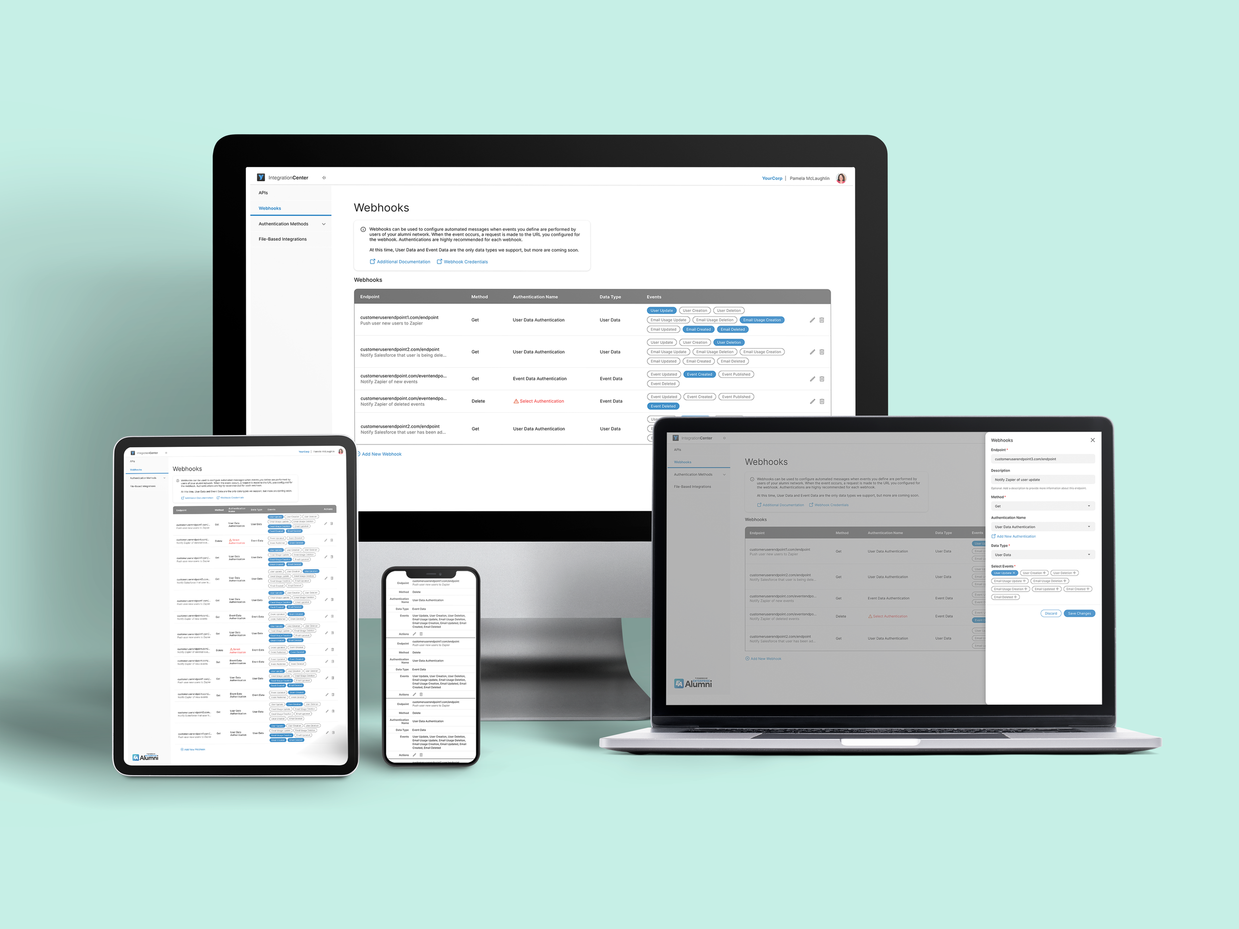
To add a new or edit an existing webhook, users can view all of the corresponding information in a side view panel. Users can select table rows to edit individually and see all of the information they’re adding or editing in context of their larger goal.
Moving on from my initial plan for in-line editing resulted in a simpler and more intuitive interface overall.
Current Design Solution
Following my design process, I devised an intuitive, seamless, and mobile-responsive solution that can be easily adapted for other components of Integration Center.
Rather than in-line editing, users can add contents for a new row via the side view panel. To edit, users select each row individually and update that row’s contents via a side view panel, limiting technical complexity overall. Additionally, users can see all of the events that are available for a particular webhook at a glance, not just the ones they have selected.
Watch the video below to see Webhooks in action.
Next Steps
In future iterations, we would like to add the abilities to sort and resize columns. These both increase technical complexity and would have been difficult to implement for the MVP, but may be worth revisiting depending on user need.
We could also implement a testing mechanism to allow users to send test events to their configured webhooks. Users could use this mechanism to validate the webhook setup and ensure that it is functioning as expected.
Based on user feedback, we’ll continue iterating to meet the evolving needs of alumni administrators.
Reflection
I am particularly proud of the level of responsiveness I incorporated into this design. As the components of Integration Center can be used across various devices and platforms, I prioritized ensuring that the product is accessible and user-friendly on different screen sizes. This required careful consideration of layout to ensure a seamless experience for all users.
Additionally, handling the technical complexity of Integration Center has pushed me to expand my understanding of the underlying technologies, specifically webhooks. I have enjoyed working closely with a cross-functional team to understand the technical requirements and constraints and find creative design solutions.
This project has allowed me to push my boundaries as a designer, grow my skills in responsive design and technical complexity, and collaborate effectively with cross-functional teams. This experience has not only enhanced my technical skills but also deepened my appreciation for the collaborative nature of product development. I am proud of the design I have created, and I look forward to seeing how it positively impacts alumni administrators.